


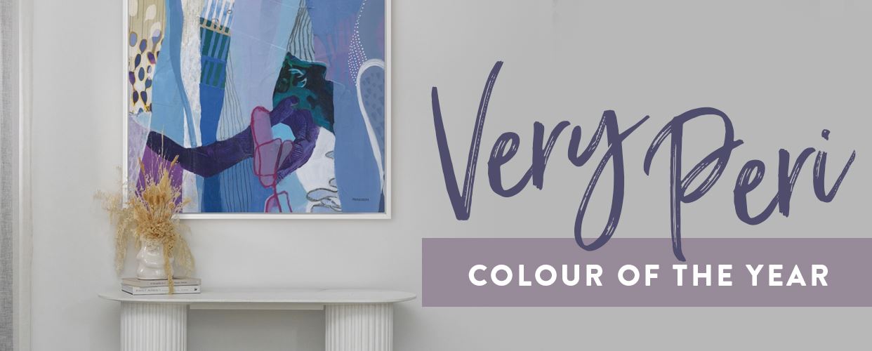
Very Peri – How to Style Pantone’s 2022 Colour of the Year for Your Home
As we’ve all experienced in the past couple of years, our world is constantly changing.
While many of us have felt unprepared in the past, this new year brings with it a new opportunity to welcome liberation and feed our souls.
It’s time to embrace new experiences, try new things, and experiment with all the world has to offer. Pantone certainly hasn’t backed down this year.
To keep up with this theme of newness, they’ve taken the concept quite literally with their 2022 Colour of The Year.
For the first time in history, the Pantone Color Institute has created a brand new colour.
Very Peri is a periwinkle blue hue with violet-red undertones – sustaining the familiarity of the blue family,
whilst leaving room for a new joyous, optimistic attitude using the violet-red undertone that
inspires creativity and artistic expression.
A presage for recent transformative times, Very Peri is a blend of two beloved shades
that has become something unexpected, different – boldly unique.
Now more than ever our world is ready for something new. Something innovative.
Something that represents hope in an ecosystem where expecting the unexpected is the norm.
As for how you can incorporate this exciting new shade into your home or office space?
Get all the inspo you need from our curated list of these perfectly matched premium art pieces, wallpaper,
and homeware, furniture and décor from our collection.
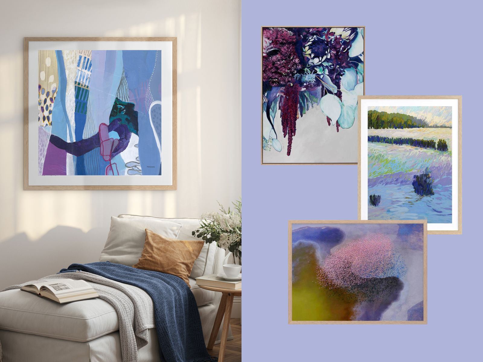
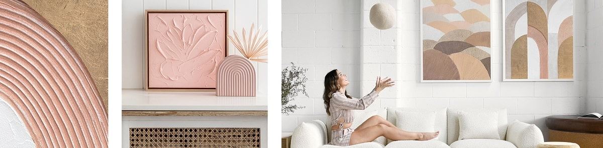
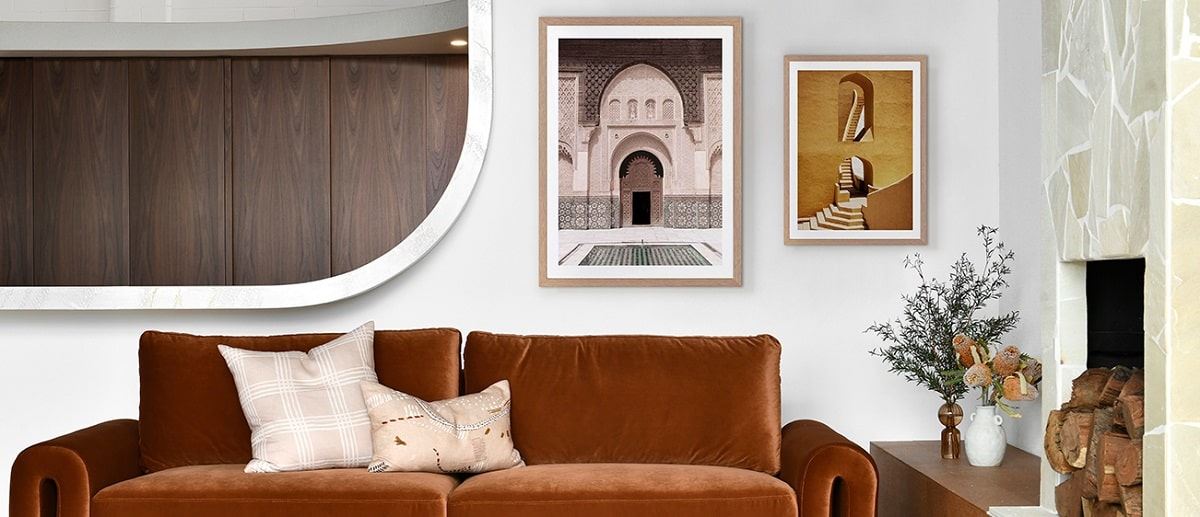
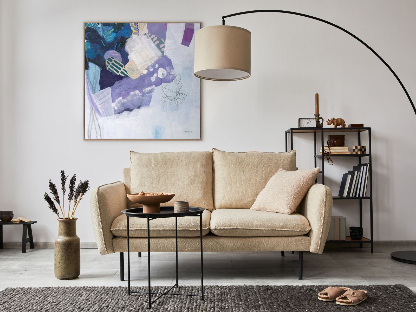
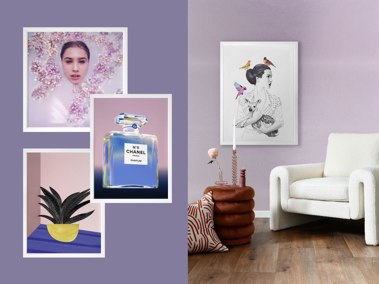
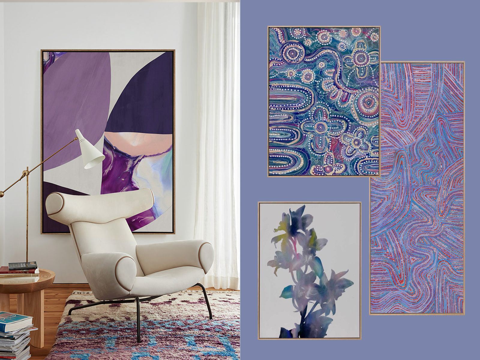
Premium Art & Posters
Whether you’re into modern or traditional, the good news is that Very Peri is easy to incorporate into many interior design styles.
With its foundation in classic blue shades, it maintains a sense of normalcy, whilst the invigorating violet-red hues amp it up for that contemporary,
refreshing feel. Our premium art and poster picks range in style, from abstract pieces with unique shapes and pattern combinations to
more realistic imagery using intricate details. Some artworks and posters allow this energizing periwinkle shade to dominate,
while others use it as an accent colour to bring some warmth and energy to the overall look.
SHOP THE LOOK
POSTERS:
PRINCESS PIKE POSTER
DAHLIA I POSTER
ART PRINTS:
A FLAMBOYANCE CANVAS ART PRINT
WHEN IT SNOWS FRAMED ART PRINT
MINA MINA JUKURRPA V CANVAS ART PRINT
ISLAND OF SOLITUDE II CANVAS ART PRINT
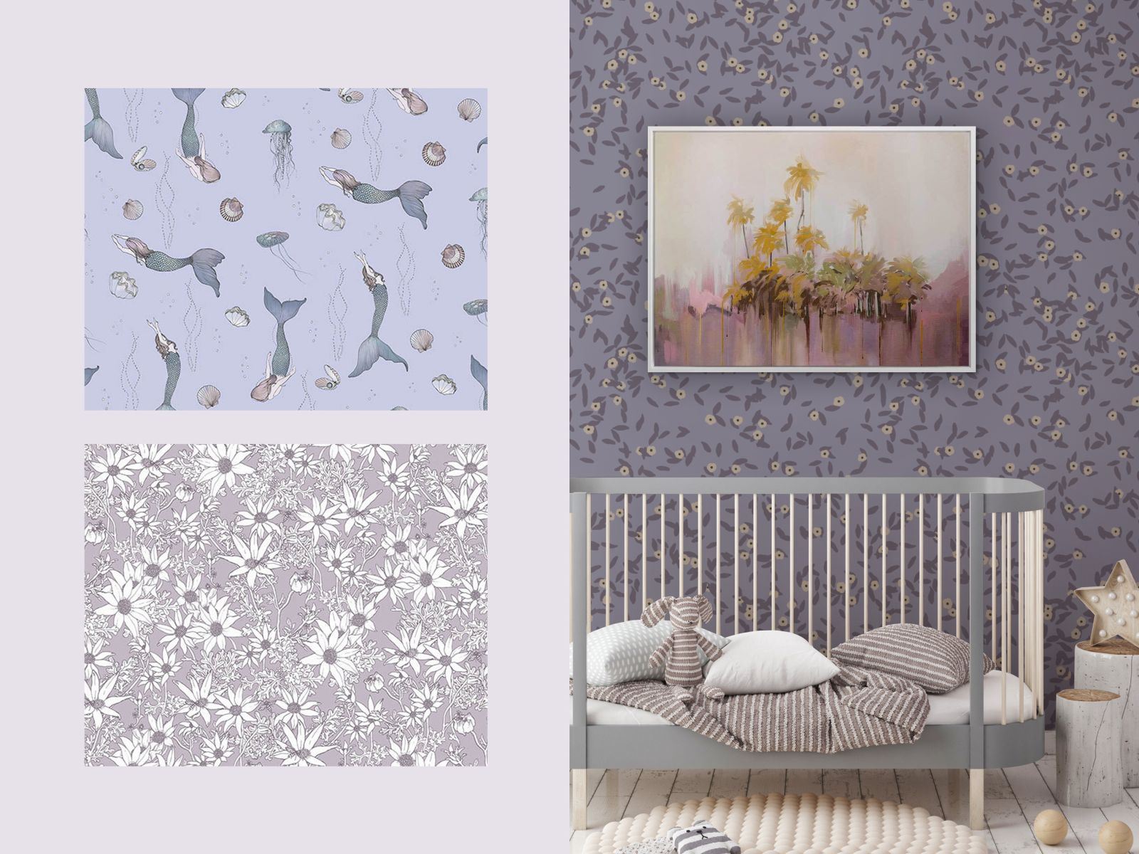
Wallpaper
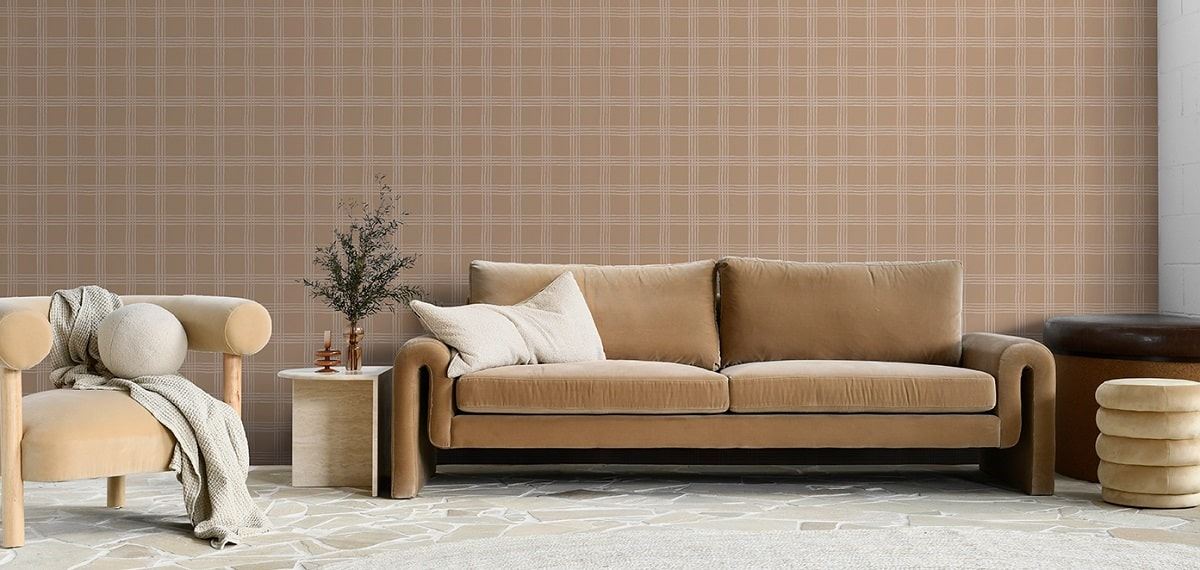
Very Peri is so very a daring colour, so why not continue that theme and get adventurous with your wallpaper?
This hue is all about empowering your space, inspiring the curious minds of you and those you hold close, evoking hopeful energy for all
that the new year can bring. With its playful vibe, Very Peri works beautifully for children’s bedrooms or playrooms.
But it can also be seamlessly incorporated into sophisticated, contemporary spaces.
Use it as an accent wall, or choose a wallpaper from our collection with softer lavender tones that blend well with neutral hues such as earthy browns,
soft greys, and creamy whites. If you’re feeling extra adventurous, Very Peri can even meld with unusual colour pairings,
from bright cherry red to aquamarine green.
SHOP THE LOOK
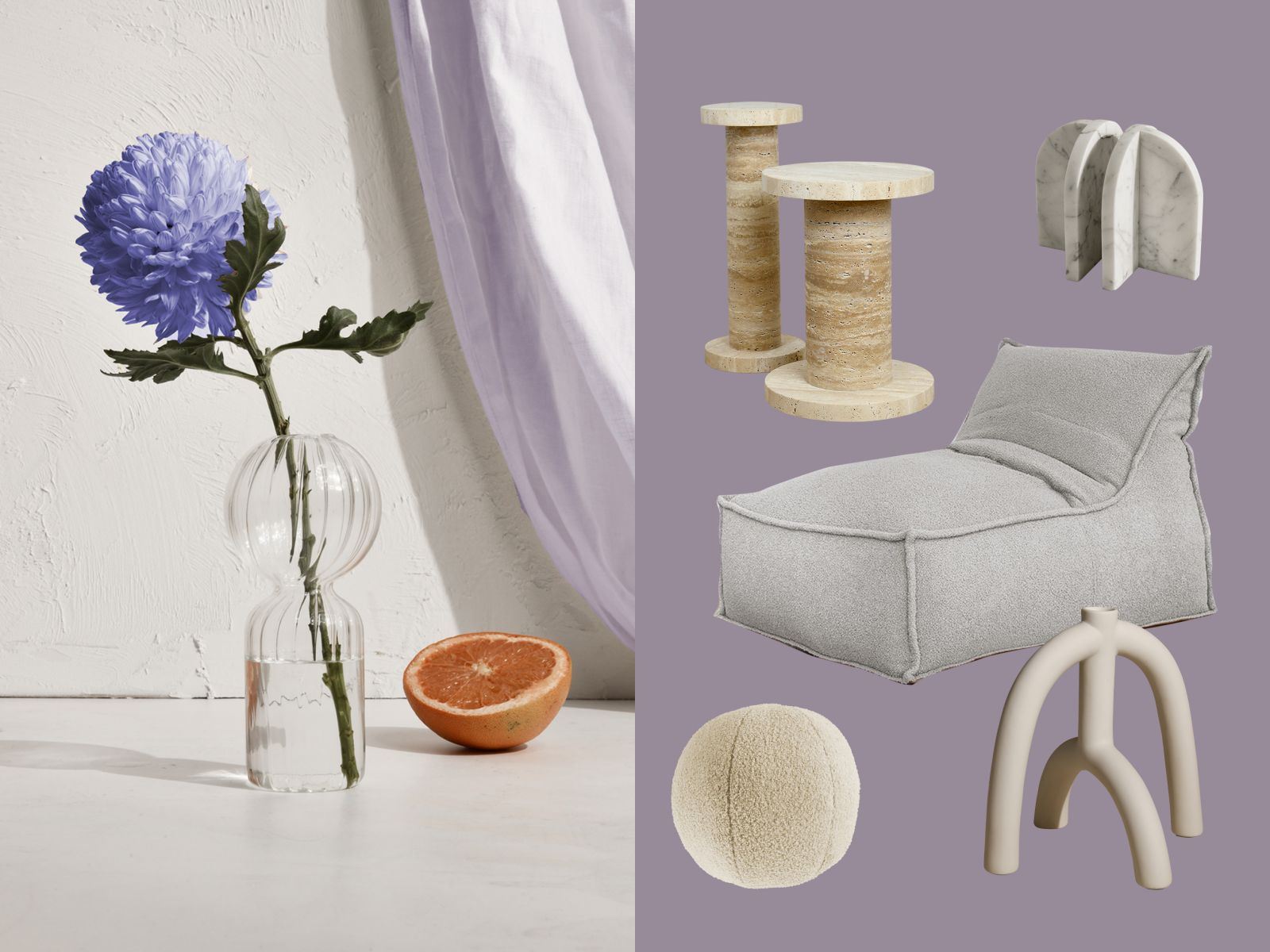
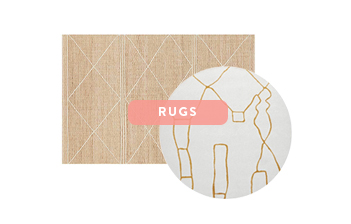
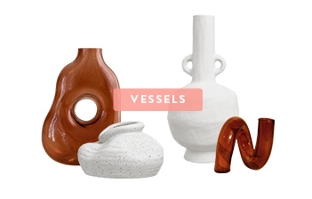
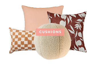
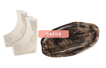
Homeware, Furniture & Décor
As we emerge from a challenging two years, many of us are looking to restore our space and find comfort in a sense of renewal.
This then gives us the courage to explore our creativity, fostering imagination and remaining hopeful for what’s to come.
Very Peri does just that, with its lively violet-red undertones that give it an energetic presence,
and that are flawlessly balanced by pairing with neutral shades.
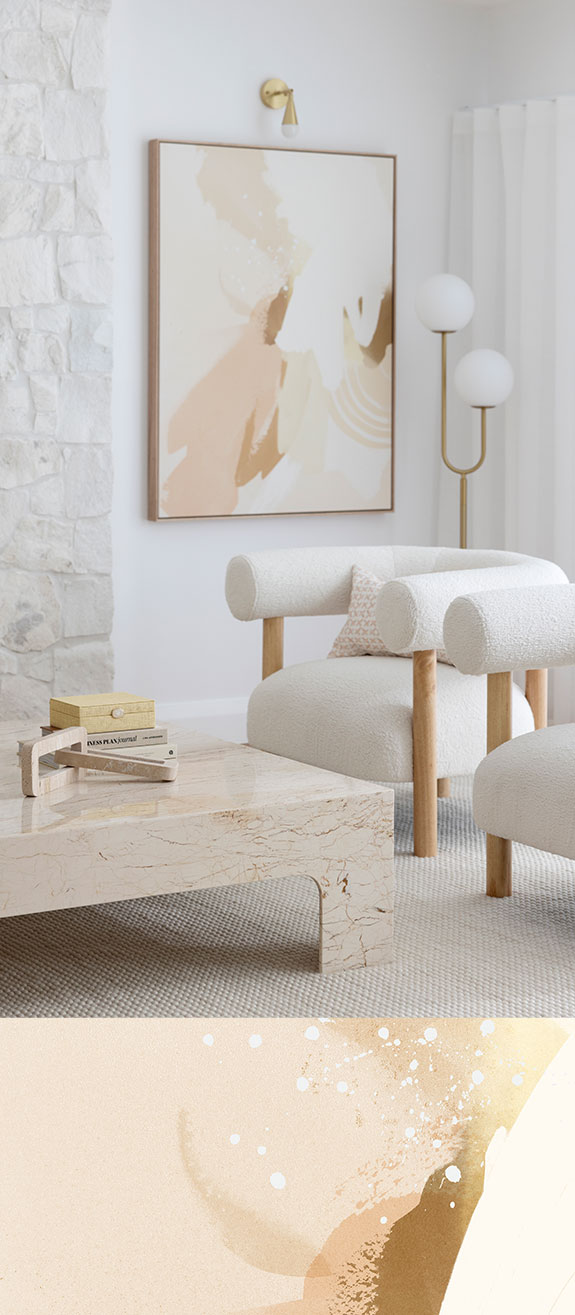
Very Peri is versatile at heart, making it the perfect statement shade among neutral homeware, furniture, and décor.
Tone it down with a creamy vanilla coloured chair or side table, a few beige-toned or lightly coloured vessels, and a candle or three.
Don’t be afraid to choose pieces with unusual shapes or curves, or different textures and finishes –
they won’t clash with the loud Very Peri hue as the neutral shades balance everything out.
SHOP THE LOOK
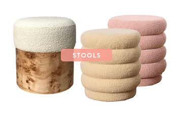
HOMEWARE & FURNITURE:
LUCIA ROUND BOUCLE STOOL WHITE
DÉCOR:
AURELIA BOOKEND IN CARRARA WHITE
VANILLA MILKSHAKE SQUARE CUSHION
Get your hands on this season’s hottest colour.
Shop on-trend art prints, fine art, and premium home accessories today.


