


Choosing art is one of those crucial interior decisions for anyone trying to complete their home, and create the flow and style they’ve always dreamed of. It can be a daunting process, and so many factors are involved to get the right fit for your home - from colour, style, sizing and even the frames... Who would have thought there were so many considerations in getting it right!
As a Designer, I make decisions like this all the time for my client's interiors, and I’m now sharing my fave top 4 tips to getting it right for your own home.
TIP 1: KNOW YOUR STYLE
Understanding your style is so important when selecting your art. Whether it’s coastal, contemporary or a Hamptons aesthetic, it’s nice to see when art connects to the interior style and tells a story about your home's interior, flowing and connecting with each space.
When you are confident in your preferred style, it makes the process of selecting your artwork so much easier and you'll find yourself automatically gravitating to your favourite piece!
My favourite Urban Road pieces that suit my own personal style are the Contour prints. The black and white palette pairs perfectly with a contemporary interior style.
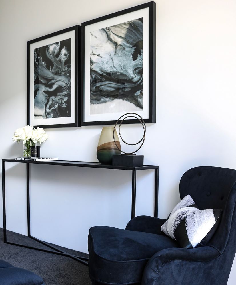
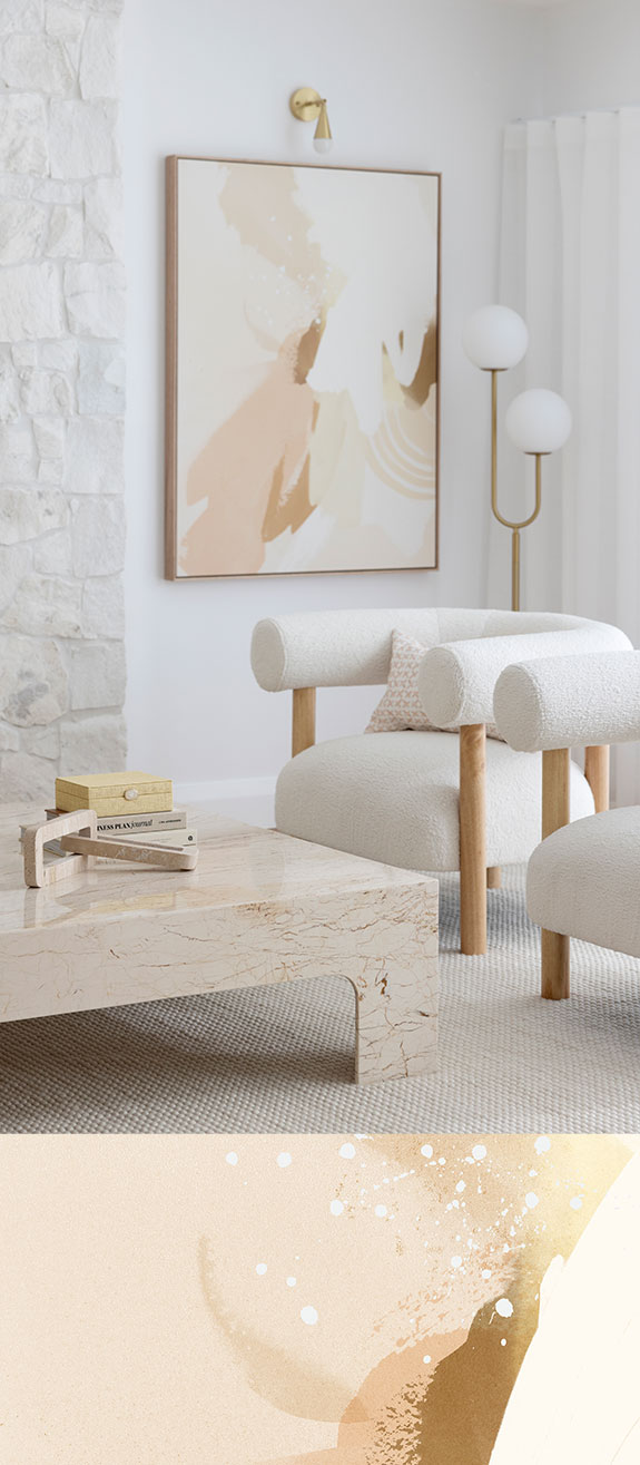
Image: 13 Interiors - Villarica and Vesuvius Black Framed Prints, Lexicon Square and Domino Lumbar Cushion
TIP 2: WORKING WITH COLOUR
I always find that when clients are looking for that dream piece, they are first consciously thinking about a colour scheme to match their interior style and then trying to make that piece fit. Which, don’t get me wrong, can be an option to choosing art, but I always recommend choosing a piece because you actually love it. Don’t get caught up in trends or fads - instead, get caught up in the emotion of that stellar piece.
Once you've chosen and fallen in love with a key art piece, I like to use the 60-30-10 colour philosophy as a guide to create the colour palette for the home. Have the main colour make up 60% of the room, the second 30% and then the contrasting touches as the final 10% - all flowing from the beautiful art piece that you've chosen!
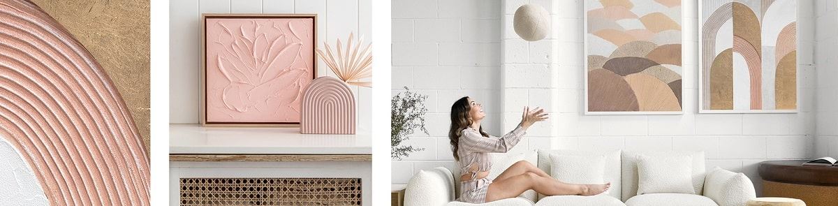
Hot on my list from the latest Urban Road range is Molten Rock, with pops of green, pastel pink and black. Pair it with a black or white frame for a striking colour pop to any room!
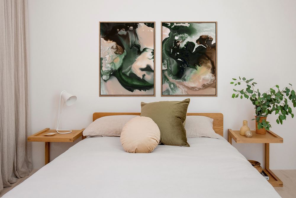
Image: Urban Road - Molten Rock I + II Canvas in Timber Look Box Frame
TIP 3: SIZING YOUR ART
When it comes to the sizing of your art, I always say bigger is better! Often the artwork will be the key focal point to your room, and focal points are called ‘focal’ for a reason. Be sure to always measure your space and the wall that the artwork will be positioned on. The common rule of thumb is to cover 2/3 thirds of this space and to always aim to have your artwork hung at eye level. If you’re spending the money on an amazing piece you don’t want to hang it only to find that it’s too small, leaving the room looking completely out of proportion. If the size isn’t right, then you’re not going to give the piece an opportunity to shine.
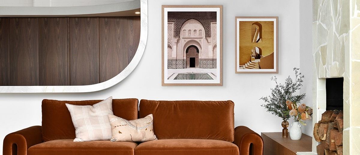
In our recent Wembley Downs Master Suite makeover, we incorporated the Verdure prints to be positioned in between the bedhead posts, creating interest up high and drawing your eye around the room. The sizing was critical to ensure that the prints were positioned in between the two bedposts and at eye level, all whilst ensuring they didn't over shadow the big four-poster bed and bedhead feature! This way the prints were still an amazing focal point and complimented the amazing bedframe at the same time.
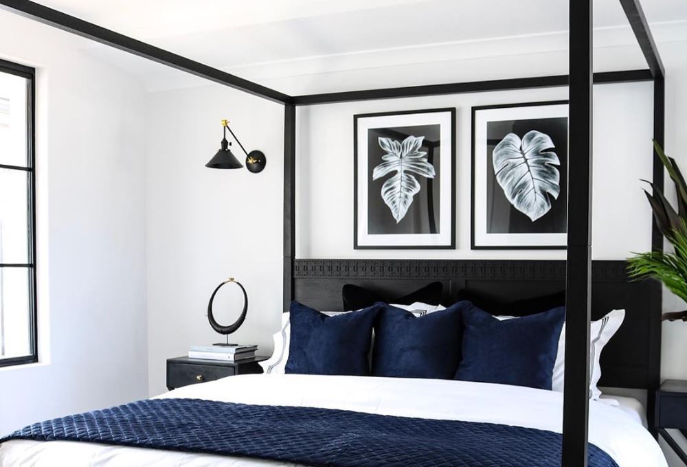
Image: 13 Interiors - Wembley Downs Master Suite - Verdure I and III Black Framed Prints
TIP 4: FRAMING STYLES
There are multiple options when it comes to framing your artworks, but there are a few key considerations to make before you decide on what’s right for your piece.
My first consideration is always to choose the correct type of frame, whether its a box frame canvas or a traditional framed print. Both options create a considerably different aesthetic and look for a room.
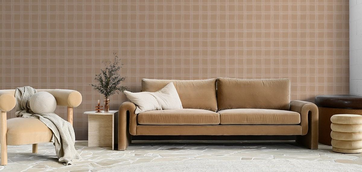
My next consideration is the frame colour. This is almost as crucial as picking the right art piece! I'll always choose a frame colour that flows with the style of the home. If the home has a moody interior and lends more to a darker palette, then I will go for a dark frame colour, like black. If the home is light and bright and filled with light furnishings, then I would opt for either a white or timber frame.
One tip with using timber is to ensure that the colour of the timber frame doesn’t clash with other timbers you may have in the home already, but rather try to complement it.
A perfect example of art frames complementing a colour scheme is the canvas print from our recent Duncraig Project. The coastal inspired canvas piece, 'Take Me Back', is framed in the timber look box frame which creates a cohesive look with the light colour palette and floors, while connecting to the caramel tones in the styling.
Image: 13 Interiors - Duncraig Living Room - Take Me Back Canvas in Timber Look Box Frame
_
Kelly Donougher is the founder of 13 Interiors, a Perth based interior design business built from Kelly's desire to create beautiful spaces that are both original and practical. Kelly's portfolio of projects includes features with brands and media outlets such as Channel Nine, Snooze Australia, Domain.com.au and realestate.com.au. To stay up to date with Kelly's latest projects and design work, make sure sure to head over to her instagram page @13interiors and give her a like!


