

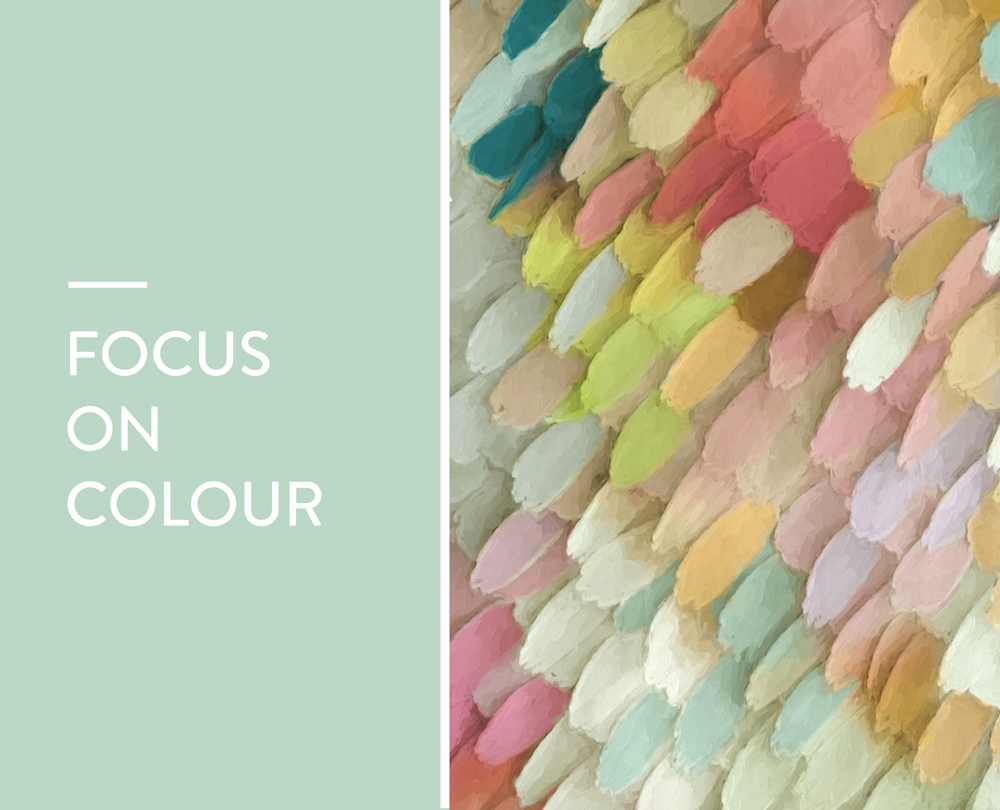
That is why it is so important when decorating and choosing art and accessories for the home, to understand different colours and the look and mood they create. The effects of colour can be subtle but very significant, and also physical and psychological. Sometimes we can underestimate the importance of colour, however it can have quite a significant effect in our home and where we work.
Here we look at different colours and the way they affect our mood.
YELLOW
Usually associated with happiness, as it makes us think of sunshine, sand and summer. So a great colour to use in a happy and fun space, plus it can also make smaller spaces seem bigger. However, less is certainly more when it comes to yellow – too much and it will quickly change the mood from happy to uneasy.
RED
This is a very emotive colour and therefore should be used sparingly in the home. Strong emotions such as danger, passion, strength and love are associated with red; therefore the right tone and placement are key to its success. It is a very energetic and visible colour, so perfect for making a design statement.
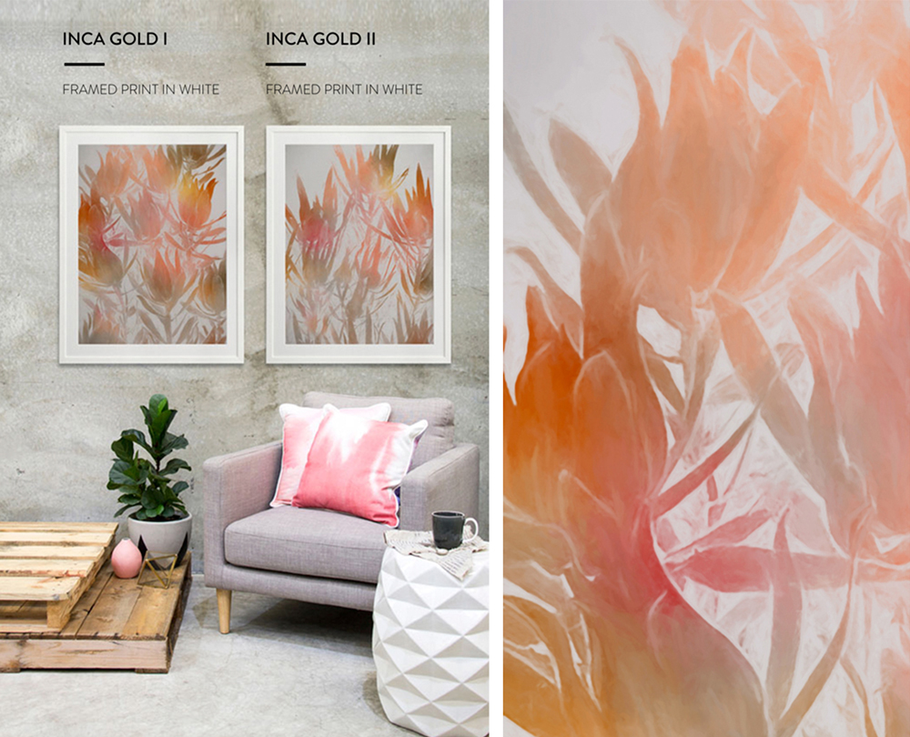
ORANGE
Not as aggressive as red, but still a high energy colour which apparently increases theoxygen supply to the brain, and can stimulate mental activity. This is a joyous and creative colour, so therefore ideal for a creative or work space in the home.
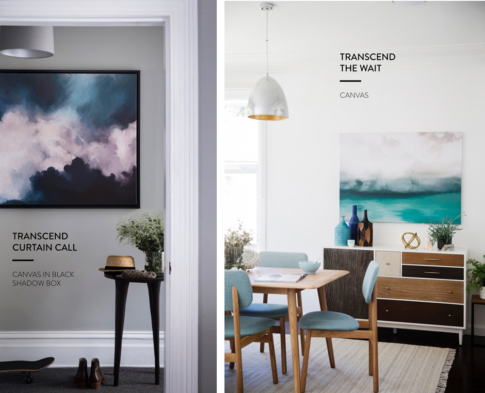
BLUE
A very solid and safe colour, that makes us feel calm and relaxed - think of the calming essence of the sea and sky. Create mood and drama with multilayered blue tones, as too much of the same tone can feel slightly cold. Turquoise and cobalt are inviting colours that will add warmth.
PURPLE
This colour manages to convey a variety of moods depending on the shade used. Royal purple and other rich shades can be sophisticated and add depth, whilst softer shades such as violet and lavender, can be calming and tranquil.
GREEN
This reminds us of being at one with nature - it is a bright, fresh and a welcoming colour. Also, it can add a really positive energy to a home. Green is a great colour to decorate with, as it works in pretty much any room in the house.
WHITE
A light, pure and safe colour that works as a perfect base in any home. However when overused it can quickly become clinical, so use different shades of white to create depth and balance, plus of course mix with bright colours. A common myth is that white instantly makes a room look brighter and larger, this isn’t necessary the case, although it of course lightens any room.
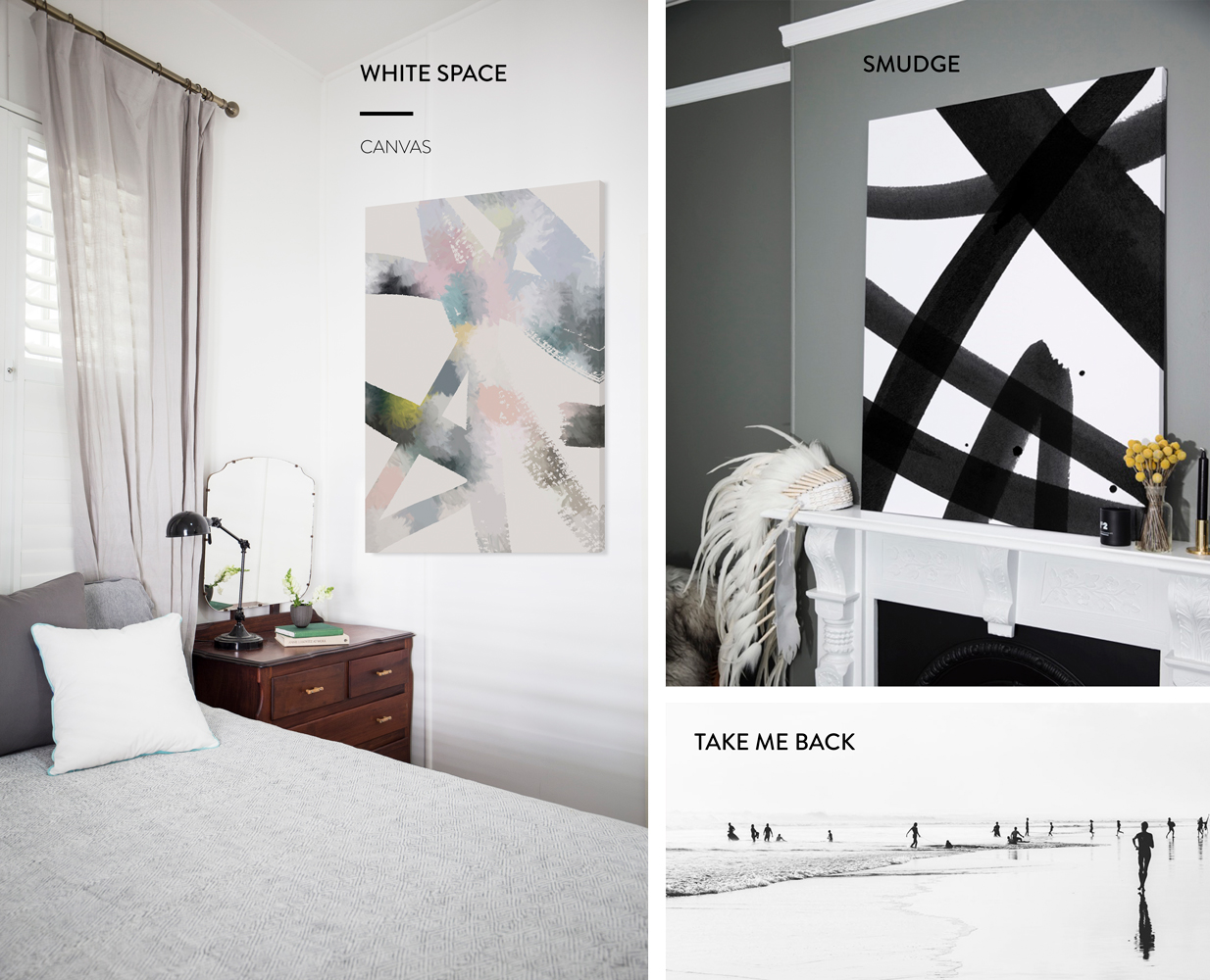
BLACK
Quite often an overlooked colour in home décor, as people tend to worry about how to incorporate it correctly. However it can be highly elegant, mysterious and powerful in the right space. Black is the perfect backdrop to make other colours pop and stand out. Contrast with colours such as orange or red to create serious drama.
When it comes to using colour, experiment and trial until you find your perfect combinations, tones and blends. Also remember when it comes to colour, light can dramatically affect how the colour is seen and viewed, so consider what the lighting is like when deciding placement.
To receive the very best in Urban Road home styling tips, trends and exclusive treats, sign up to our exclusive e-newsletter, or follow us on Facebook or Instagram.


